Every year, folks in the colour business try to predict and set the trends for the coming year by announcing a “Colour of the Year”. Pantone’s is probably the most famous, and their colour this year is “Living Coral”, an orange-pink that’s somehow both invigorating and calming. Those two things seem to be the trend this year, with green-blues and blue-greens dominating the “Colour of the Year” landscape. When thinking about these colours, it’s important to think about trends, and their overall impact on your decision making when it comes to installing new flooring.
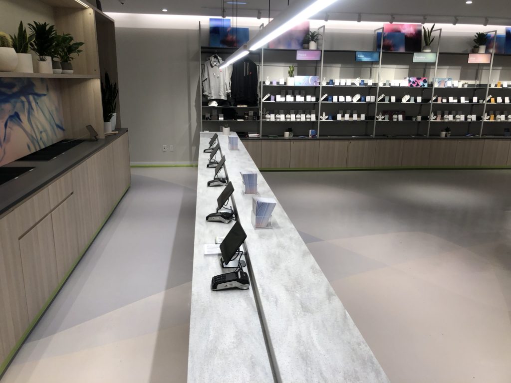
Long time readers of the blog will know how much we love colour; it can be used to visually dazzling effect, or it can be used in a very utilitarian way, creating pathing and zoning. For colour, we love both epoxy flooring and polished concrete, the limits of which are almost unimaginable; if you can dream it, we can make it in colour on your floor. That kind of versatility can feel a bit overwhelming; when you can have any combination of colours and patterns, which one do you choose? That’s why it’s important to talk about trends when we talk about flooring; one of the easiest ways to decide on a colour is to go with what’s trending right now.
The problem with this is obvious upon reflection: trends come and trends go. Pantone picks a new colour each year, so does Behr and Benjamin Moore and almost anyone else you can name. With our high quality flooring, however, you won’t need to change your floors for years, even decades to come, so you should be very cautious about simply following a trend. When choosing floor colours, it’s best to err towards what’s timeless, what you’re fairly confident will still look good for as long as the floor lasts. I’m personally partial to very neutral to cool, muted tones for this; something that’s warm and eye-catching today might very well look gaudy in a few years. Grey-blues are classic for this reason; they’re nice to look at, but not visually overwhelming.
When you made your company’s logo, you were probably looking for about the same thing: something timeless, not trendy, that will represent your company’s values and goals for years to come. The colours you incorporate in your logo can thus often be incorporated into your flooring without having to worry that it will look bad in a few years. This isn’t to say that your whole floor needs to be bright red if your logo is, but that incorporating bright red in areas of the flooring could be a good idea.
We’re a specialized industrial flooring contractor, so we have a good eye for what’s trendy and what’s lasting. Moreover, we can help you decide how important aesthetics are compared to functionality for your business; if you’re looking to create flooring in a warehouse, what’s trending probably doesn’t matter very much at all.

